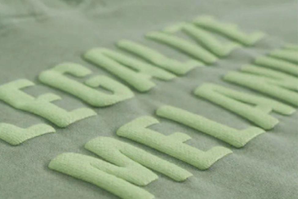
How to Design for Puff Print: File Setup, Shapes, and What Actually Works in 3D
Puff print looks simple enough, ink rises off the fabric, creates a raised surface, looks premium. But hand a poorly prepared file to a puff printer and what comes back is inconsistent elevation, blurred edges, and a design that looks swollen rather than intentional.
The technique is more forgiving of some design choices and far less forgiving of others than most people realize. If you're designing artwork specifically for puff screen printing, here's what you need to know before the file leaves your hands.
What Puff Print Is Actually Doing to Your Design
Puff ink is standard plastisol with a foaming agent added. When the garment runs through the conveyor dryer at around 320–330°F, the foam activates and the ink expands, rising roughly 3 to 5mm off the surface of the fabric, depending on ink deposit and mesh count.
That expansion is the whole point. But it's also what creates problems if the design isn't built for it. Any element in the artwork gets slightly larger after activation — edges spread outward, shapes gain volume, and anything that relies on precision at a small scale gets lost in the expansion.
Designing for puff means designing with that expansion in mind from the start.
File Setup
- Format. Deliver your artwork as a vector file, .AI or .EPS from Illustrator, or a clean .PDF with outlined text. Puff printing uses separate screens for each color, exactly like standard screen printing, which means the printer needs clean, separated artwork with no rasterized elements blending into each other.
- Resolution for raster elements. If any part of the design includes a raster element (a texture, a photograph, a gradient), export at minimum 300 DPI at actual print size. But the honest answer is: puff print and raster artwork are a bad combination. Gradients, soft edges, and photographic detail all get swallowed by the foam expansion. Wherever possible, convert raster elements to solid shapes before submitting the file.
- Color separation. Each color needs to be on its own layer, separated and clearly labeled. Overlapping colors need to account for trap — a slight overlap between adjacent color areas that compensates for minor press registration variation. On puff, trap is more important than on flat printing because the ink sits slightly higher and any registration gap is more visible.
- Underbase. On dark garments, a white underbase screen is printed first before the puff color layer goes down. This is standard practice, but it affects the design: the underbase needs to be the same shape as the puff layer, slightly choked (reduced inward) to prevent white from showing around the edge of the raised design. If your printer builds the underbase for you, confirm how they're handling this. If you're building it yourself, ask what choke value they prefer.
What Shapes and Designs Actually Work
This is the most important section. The expansion that makes puff beautiful is also what limits what you can put in a puff design.
What works:
- Bold letterforms. Block type, sans-serif wordmarks, thick lettering with strong stroke weight. The expansion makes these read more powerfully, not less. This is where puff printing is at its absolute best.
- Solid filled shapes. Logos with strong, filled areas, circles, rectangles, simple icons, expand evenly and hold their form cleanly.
- Thick outlines. If the design has outlined elements, keep stroke weights heavy enough to survive expansion. 2pt minimum; thicker is better.
- Single or limited colors. Fewer colors mean simpler setup and better control over how each element expands. Multi-color puff is possible, but it adds complexity.
What doesn't work:
- Small text. Any text below ½ inch tall is a risk. Below ¼ inch, legibility usually collapses after expansion. If the design has a small tagline or fine-print element beneath the main graphic, that element should be separated and printed flat, not puffed.
- Thin lines and hairlines. Lines thinner than 2pt will either close up or blur at the edge. Remove them or thicken them.
- Gradients and soft blends. These don't translate. The foam expansion has no mechanism for reproducing tonal variation — it either rises or it doesn't. Gradient areas will print flat at best, inconsistent at worst.
- Fine detail and intricate shapes. Anything that relies on sharp, precise edges at a small scale — filigree, crosshatching, detailed illustration — gets lost in the expansion process.
The simplest design test: if you squint at your artwork until it blurs slightly, what you're left with should still read clearly. That's roughly what the puff process will do to your details.
A Quick Design Checklist Before You Submit
Before sending your file to a puff printer, run through this:
- All artwork is vector or 300 DPI raster at actual print size
- Colors are separated on individual layers
- Trap is built in for adjacent colors (or confirm the printer builds it)
- No text smaller than ½ inch tall
- No line weights thinner than 2pt
- No gradients, soft blends, or photographic elements
- Underbase layer is included and choked, or confirmed with the printer
At Garment Decor, we review every puff print file before it goes to screens. If there's something in your artwork that won't work, text that's too small, lines that are too thin, a gradient that needs to be rebuilt as a solid, we flag it before production begins, not after.
Explore our puff screen printing service or request a quote and hear back within two hours.